Remediating documents to be compatible with assistive technology is a large part of making content accessible. Documents can be extremely complex, containing elements such as tables, nested lists, infographics including pie charts and graphs, links, footnotes, and may have creative formatting and placement of these elements. Reading order is also an important component of remediation. Once remediation is completed, however, the content must go through a validation process in order to ensure that all errors have been corrected and that appropriate contextual information is provided.
Marketing departments, for example, love to create acronyms that spell words. It does, after all, save characters in Twitter posts and it makes a long name more memorable. Writing out the Division of Emergency Response Plan is probably going to provide more information than its acronym, “DERP.”
A second example would be discerning the difference between Accessibilities and AcCeSSIBiLiTiEs. A screen reader will have difficulty with these two completely different collections of letters. The first of course is a topic near and dear to the user’s hearts, the second is a complicated chemical compound:
- Ac – Actinium
- Ce – Cerium
- S – Sulfur
- I – Iodine
- Bi – Bismuth
- Li – Lithium
- Ti – Titanium
- Es – Einsteinium
Even if you are aware of context, did you know there are two different ways of making the word “bacon” out of chemical symbols?
- Ba Co N: Barium, Cobalt, Nitrogen and
- Ba C O N: Barium, Carbon, Oxygen, Nitrogen.
Remediating tag structure is a big component of remediation, but it’s only half the battle. The information also has to make sense. It’s not enough that the elements are correctly tagged.
The Difference between Compliant and Usable
Just because the document is “compliant” and will pass an accessibility checker does not mean the document is usable for someone using a screen reader. Validation goes beyond compliance to include usability. Many of the guidelines in accessibility standards are “how-to” instructions. Technical directions about assigning headings, Alt text, structure for lists and tables are helpful, but not the whole solution. Automatic accessibility checkers (such as those built into Adobe, for example) have some serious limitations. For example, a telephone number such as 555-123-4567 may be read by a screen reader as “five billion, five hundred and fifty-one million, two hundred and thirty-four thousand, five hundred and sixty-seven”. Yet, obviously, a person seeing this number would read it as five-five-five, one-two-three, four-five-six-seven. From an informational standpoint, these are two very different numbers.
Another example we see fairly often is the use of graphics, icons or symbols to convey information, such as these commonly used travel icons.
![]()
These may appear in tables or within text in a document and would need a clear explanation beyond “icon of a coffee cup”. The amount of information that these symbols are intended to convey can vary dramatically, and are often accompanied by a single reference key somewhere on the page, or perhaps elsewhere in the document. Explaining those symbols in isolation is easy, coffee icon, icon with car and key. In the context though, a better explanation would be to clearly explain them as “serves coffee”, and “locksmith service”. But the longer or more complex the information a symbol represents, or the larger the quantity of the symbols present, the more cumbersome the experience becomes; they are after all intended as a shorthand to reduce the reading required to know what is being offered. In some cases, the best course of action for usability is to create links directly to the key.
Additionally, many documents offer mechanics such as color-coding to identify categories, such as this example:

There are various ways to convey this information, and it’s important when validating to ensure that it has been conveyed correctly, and in a way that is both understandable and operable.
Compliance is Not a Checklist
Even beyond these examples, there are some documents that can pass checkers while being INCREDIBLY broken.
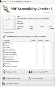
This is a screenshot taken of a file we ran through the PAC checker, a cursory glance says that it is PDF UA compliant, it has the large checkmark and everything.
However, note that there are an awful lot of zeros in the summary of checks. It’s pretty alarming that there is apparently zero content in this document.
Adobe’s checker also gives that same document a clean bill of health.
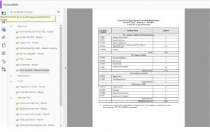
And why wouldn’t it? If we expand the tag tree we can see that it does indeed have tags.
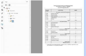
NVDA, a commonly used free open source screen reader, says something very different is going on with this document. You can see it lists every cell in the table and NONE of the content. It simply doesn’t see it and would not read anything but the cell rows and column headings, as you see in the red box showing the NVDA Speech Viewer pane.
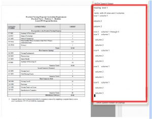
This document is an extreme case in which the Contents Pane is corrupted, but the pre-existing tag structure remains. So it can pass the majority of automated checks while containing no readable information at all for a screen reader user. This is where validation needs to be stepped up.
RemDoc’s Validation Process
In order to produce a usable, accessible document, a remediated document must go through a rigorous validation process.
The RemDoc team uses a combination of PDF checkers, including the two shown above (Adobe Accessibility Checker and the PAC checker) as a starting point in our validation process. Knowing the limitations of these, a tag-by-tag examination of the tag tree is also conducted. Finally, documents are read, start to finish, using screen-reading technology, by individuals who were not involved in the remediation process.
This three-step process enables us to find and fix extreme cases like the one shown above, where automated tools fail, as well as allowing us to identify whether, for example, a financial data table contains the appropriate multiple levels of column headers, or that alternative text assigned to links and graphics makes sense both in and out of context.
This process is the only way to ensure that content is not only tagged, and able to pass accessibility checkers, but is also usable for screen reader users. It is not enough to pass automated checkers. The information must also function properly and provide the correct information to someone accessing it non-visually.
To learn more about how your organization can reach everyone, contact RemDoc.
