Tables are Tough!
Tables are one of the most difficult elements for people using assistive technology to navigate. They are also one of the more complex elements to tag correctly to make PDFs accessible. Following are some helpful tips for tagging tables.
How does a screen reader read a table?
In order to convey the information about each cell accurately to an assistive technology user, the screen reader will first announce the size of the table, then the cell location, and continue to read the table including what changed in the location and any row and column headers that did not apply to the last cell it read.

So this table would read:
- Table with five columns and four rows.
- Column 1, row 1, Rainfall inches;
- Column 2, Americas;
- Column 3, Asia;
- Column 4, Europe;
- Column 5 Africa. Row 2, Rainfall (inches)
- Column 1, Average, Americas;
- Column 2, 133, Asia;
- Column, 3, 244, Europe;
- Column, 4, 155
- And so on…
Unlike most elements, a screen reader user may navigate a table in 3 dimensions, going straight down a column. So navigating down column two would be read as:
Rainfall (inches); Column 2, Americas, Average row 2, 133; 24 hour high, row 3, 27; 12 hour high, row 4, 11.
Complexity Can Lead to Confusion
You can see how a more complex table with merged cells could quickly add to the cognitive load of understanding the information being provided via a screen reader. Row 1 may contain 5 columns, while row 2 could have just one, leading to no announcement of four expected subsequent columns. Merged cells can also lead to an assistive technology user landing somewhere they do not expect.

In the above simple example. Navigating to the left twice from Cell 9, and then right twice, will land a screen reader in Cell 3. And if they then try to get their bearings by navigating up to the top of the table and back down once, they will go from Cell 3 to Item 1.
When a Table Isn’t a Table
You should understand that not all “table-like” formatting should be tagged as a table. A screen reader will read the row and column header for each cell before reading the content in that cell. This means information that appears to be a table should only be tagged as a table if the information is actually tabular.
Here are some examples of content that aren’t tables.
Calendars
Calendars are not usually tables. The cells should be tagged individually as date and content (“Friday 6:30 AM breakfast with Pat” for example.) The use of a table for many calendars is not advised. This calendar below, for example, would read Wednesday, 6:00 AM Blank, 6:15 AM Blank, 6:30 AM Blank, 6:45 AM Blank, etc. Most of the cells would read “Blank.” That is a massive click and time commitment to find a single appointment on this “table.”

Multi-Column Layouts
Just because the content is arranged in a grid pattern doesn’t make it a table. This layout below shows varying columns and blocks of text. They are not related to one another, and should not be put inside a table tag. Using a table to preserve spacing and formatting within a document is not recommended.

Forms
Forms should almost never be tagged as a table. Instead, tag each form field and its tooltips without a table tag at all. The example below would not function as a table. The various form field labels seen would not be related to other cells below in a table format. If this were tagged as a table, “Customer Order Number” and “Date” shown in the top row of this form would be tagged as headers, and they are not headings for the content below.

Tables of Contents
Tables of contents are a separate tag type and should not be tagged as a table. If you tagged this example below, it would not work properly with a screen reader. “3 Top Picks,” “18 Chef Highlight,” and “28 Kitchen Aid” would be the headers. Then when the screen reader read the next line, the first cell would read “3 Top Picks” and then “6 History Lesson” to indicate a relationship between the header and the cell below. In this case, that is not a correct relationship and the screen reader would be conveying incorrect information.

Tagging Tables
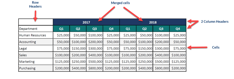
So now that we’ve discussed how a screen reader interprets table tags, and what is NOT a table, let’s take a look at how it should be done. Below shows the basic elements of a table.

Headings
All row and column headings should be tagged as headings. This way, they will read with each cell so that the information is clear. Many tables have multiple row and column headings so this can be confusing to tag.
Links
Any links in the table cells should be tagged as such.
Blank Cells
Cells that contain no content can be confusing for an assistive technology user. Ideally, there should be no cell without content in any table. The screen reader will read the row and column headers and have nothing to report to the assistive technology user about the cell contents. It’s helpful to have the content read “blank cell” or “intentionally blank” for these.
Merged Cells
Merged (or spanned) cells are also very confusing but are frequently seen in Tables. They are commonly seen when multiple headings are used. In this example below, you can see that 2017 and 2018 are broken out into four quarters using two column headings. These merged cells need to be tagged so that both column headings will be read for each cell. “2017, Q1, Human Resources, $25000.”

Cross Page Tables
When a table is very large, it can sometimes span across multiple pages of a document. Making sure all the content is connected and tagged as one table can be cumbersome.
Table Summary
A Table Summary is required by WCAG. It provides vital information to the assistive technology user about the structure of the table. It should include a description, the number of row and column headers, and explanations of any merged cells or other structural abnormalities. The summary can be edited to include a description and any other pertinent information.
An example of a table summary for this table might be “Seminar schedule. 4 rows, 4 columns. Merged cells in Row 1 and column 2.“ (Note: This table is very difficult to parse. There are better ways to provide this information in the source document.)

Tagging Tables Doesn’t Have to be Hard
Despite the complex interaction between headers and cells, tagging tables doesn’t have to be a difficult. You can quickly have your tables tagged, along with everything else, with RemDoc’s PDF remediation service.


