In this intro course we will learn about making accessible PDF and Word documents. What we will cover is:
- Some Background Information
- Accessible Text
- Accessible Formatting
- Understandable Logic
- Works with Assistive Technologies
So lets get started!
Accessibility Background
Over 61 million (26% or 1 in 4) adults in the United States live with a disability. It affects the way people access, perceive, and use information. Disabilities include being:
Many people use assistive technologies, such as screen-readers, vocal navigation, magnifiers, Braille Keyboards, captions, and transcripts. Documents need to work with these technologies/systems and be usable. Why you may ask? Because it is the law…
There are civil rights legislation, ADA and Section 508, which have been around in some form since 1974. You are obligated to redo inaccessible documents, whether or not you knew about them at the time. It might seem confusing at first on why you have to do this, but try navigating inaccessible documents with a disability. It is difficult. Internal and external documents/communications must be accessible. Accessibility benefits everyone!
Text should be Text
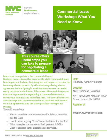
- Do not make text an image (for example, like in a meme) – screen reader users cannot read it.
- An example of what not to do: copy-paste the image of a flyer into an email. The text does not carry over.
- Test: You should be able to highlight and copy any text on a document.
- Use text recognition when scanning a document. (“searchable PDF”)
- Transcribe before recreating.
- Fancy titles, logos, and other fancy text may need alternative text.
Do not do this!
Structure is Important
- A document needs a clear structure established with headings, lists, and paragraphs to be readable by everyone.
- Use titles and headings provided in Microsoft and Adobe, and tag them.
- Use ordered or unordered lists. Do not undo the formatting.
- Use bullets and not images of bullets or checkmarks.
- Have a consistent navigational pattern in longer documents.
- Sidebars need to be integrated into text.
Colors should Contrast
- The color of text must be easily distinguishable from the color of the background.
- This allows color-blind users to read and use your documents, and people with other vision disabilities.
- The WCAG level AAA requires 7:1 ratio for normal text and 4.5:1 ratio for large text. Technically this means that the darker color must absorb 4.5 times light or be 4.5 times darker than the light color.
- You should use a contrast checker to check colors.
- What is considered “Fun” combinations of colors are usually inaccessible ones.
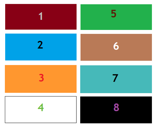
Dark text on a white background and white text on a dark background work best. Yellow and orange are generally almost impossible. SBS green is not compliant on a white background.
Colors should be Used Well
- Do not use too many colors or too many bright colors. Busy documents are hard to use.
- Yellow should be avoided whenever possible.
- Do not distinguish with red and green, or blue and yellow.
- Highlighting should be avoided.
- Dark and earthen colors on a white background tend to be more accessible and usable.
Use Good Fonts and Proper Formatting
- You should use Sans-Serif straight-line fonts for accessibility to people with dyslexia and vision disabilities.
- Serif font have little hooks at the end of letters like in Times New Roman font.
- Handwriting-like fonts, like Comic Sans or the Samsung handwriting fonts (Choco Cooky, Cool Jazz, and Rosemary), are not accessible.
- Recommended Fonts: Arial, Calibri, Helvetica, Tahoma, and Trebuchet MS
- For translation into non-Latin scripts, check for accessible font practices.
- Use bold and italics sparingly. Use underlines more so. Do not highlight and do not use all capital letters.
- Break up paragraphs and use headers where possible. This makes it easier to follow.
- Size 12 or greater font size.
- Keep font size consistent and fonts consistent within a document.
Don't Make it Hard to Read
- Your documents should generally not be above a 1oth grade reading level. Use a free online app called Hemingway Editor to measure the readability of your document.
- Never go above a 12th grade reading level.
- If you can get it to 6th through 8th grade reading level the better.
- Safety information should never be beyond a 6th though 8th grade reading level.
- Avoid idioms, conjunctions, or sounding to folksy. Be direct.
- Use the Plain Language Checklist to see if your document meets plain language standards.
- Accessible for people with cognitive disabilities and people with limited English language.
- The document is easier and less expensive to translate into other foreign languages.
- The law usually does not require the exact language of the law, and ditto for the regulation.
- Edit, Edit, Edit…
- The documents needs to sound clear and not fancy.
- Purple prose (“It was a dark and stormy night…”) is bad writing!
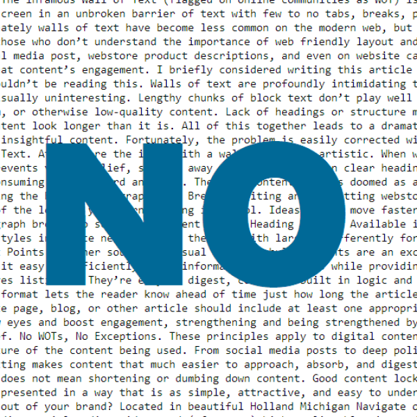
- Avoid the dreaded “wall of text”.
Tabbing is Necessary
- People should be able to tab between headers and fields in a document.
- Tabbing needs to be doable in the correct and logical reading order of the document.
Tag Your Content
- All content in your document must be tagged for logical reading order.
- If people are meant to fill out a form on the computer, it needs to be indicated as such.
- Logical Reading Order – Use Adobe Acrobat to tag reading order, judicious header use in Word.
- The PDF Accessibility Checker in newer versions of Adobe Acrobat will guide you through this process.
Images Require Alternative Text
- All images need to be described “behind” the image with text if they are anything more than decorative.
- This is called “Alternative Text” or “alt text.”
- This includes charts, graphs, diagrams, and maps.
- If the information is available in text above or below, use the alt text to indicate that.
- There are two styles: Concise and Detailed. Use detailed for images that are central to content, and concise for marginal or things already stated in the text.
- Where possible, write out the information.
- Right click on the image and select “format image” or “edit alt text.”
- Charts, graphs, and diagrams made in Excel will have information on the back.
- Tables made in Excel that have no blank cells are generally accessible. Do not use blank cells – use “0” or “-” for blank. Tables that are images need to be described fully. In PDFs, the charts will need new alternative text.
Check Everything
- Always check your work.
- New versions of Microsoft Office and Adobe Acrobat have an Accessibility Checker that covers most things. You will still need to check fonts, colors, formatting, and reading level manually.
- Remember for reading level, use an online grade level checker, like the Hemingway App.
- You should be able to tab through a form, highlight all text, and navigate by headers.
- If you have access to a Mac computer, test run your document on VoiceOver.
- It is better to redo a document now than be forced to redo it after a lawsuit or call from the Comptroller!
Braille Printing 101
- For many blind and low-vision people, Braille may be preferred for longer documents to reading with a screen-reader on the computer.
- Documents need to be written in a plain Word document – no tables, no graphs, no fancy stuff.
- Tables need additional, special formatting. Different printers will have different conditions for them and it is best to contact the printer.
- The Braille Authority of North America has a handy manual on correct formatting.
- Once the document has been properly formatted a Braille Printer is used to make a physical copy.
Captions and Video Descriptions
- Captioning is a profession! It is hard!
- There are ways to amateur-caption videos.
- YouTube automatic captions are…not great. Inadequate captions are still inaccessible!
- You can transcribe videos directly on YouTube or use a captioning software (recommended).
- Videos produced by government agencies are required to have captions.
- Captions need to be in fonts and formats that are readable in the same manner as documents.
- Recommendation: Use a black bar with white text. (YouTube format is accessible.)
- Videos also require audio descriptions explaining what is going on in the visuals. That is also a profession but can be done by anyone. (The FCC has an excellent guide on this.)
- Captions are better than American Sign Language (ASL) interpretation in the video.
Good Email Practices
- Use the same fonts, formats, and language practices for documents.
- Bold, italics, or underline should be used sparingly.
- Do not highlight!
- Do not use all capital letters!
- Do not use color as the only separator. (I usually respond in chains with bold and a different color.)
- Use names or other context clues.
- Do not just “make it a call!” Some people cannot hear.
Now you are better armed with the information you need to make your documents accessible. If you need any help don’t be afraid to reach out and get an accessibility document review.
